Articles | Photography Blog | Office Tips Blog | about me | e-mail

Helen Bradley - Photoshop and Lightroom tips and techniques

Monday, October 26, 2009

Photomatix Pro: Create an HDR image


It seems like HDR or High Dynamic Range imagery is all the rage right now. There are lots of tools around for assembling an HDR image and, although Photoshop now has a tool to do this, PhotomatixPro is much more sophisticated and the results are much better, so I'll show you how to use it.

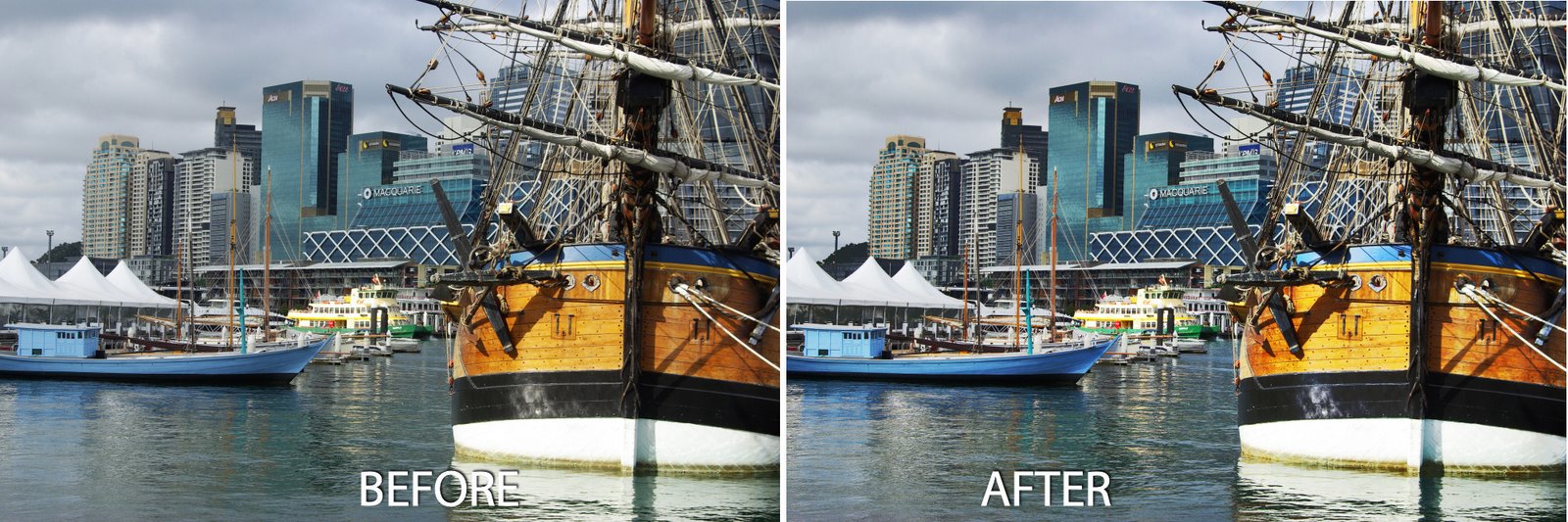
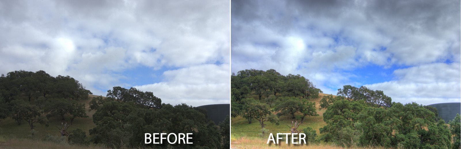
Before we start, however, a bit of background as to what HDR is and why you might use it. One of the limitations of digital cameras is that they can only capture an image with a fairly narrow dynamic range - the range of lights and darks in the image. In fact, faced with a scene that has very bright areas and very dark areas, you and I can see much more detail in the scene than the camera can capture in one shot.

However, the camera can capture lots of images of the same subject each with a different exposure. So you can expose for the light areas and again for the dark areas and again for the midtones and capture 3 of more images of the same subject that together show all the rich detail in the shadows and in the highlights. What HDR software does is to help you assemble these images into one image with a wider range of lights and darks than you can get in a single image.

To capture for HDR, ideally you need a series of images shot using a tripod so you eliminate movement between the images. Your overall camera settings should not change from one image to the next – except that the exposure for each will be different. Typically you'll use your camera's Auto Bracketing feature to capture the series and it's best to limit your shooting to a scene that won't change while you're capturing it so you don't get movement between frames.

It is possible to render an HDR image from a single camera raw image and you would have to do this if you were shooting a moving crowd for example. However it's best, where possible to capture multiple separate exposures. If you're using an IS camera disable this feature when shooting on a tripod - leaving it on can actually cause camera movement.

A trial version of Photomatix Pro 3 is available from www.hdrsoft.com so download and install it. If you don't have suitable images to work with, there are three sets of sample images on the site that you can use. Here's how to assemble an HDR image from multiple exposures:
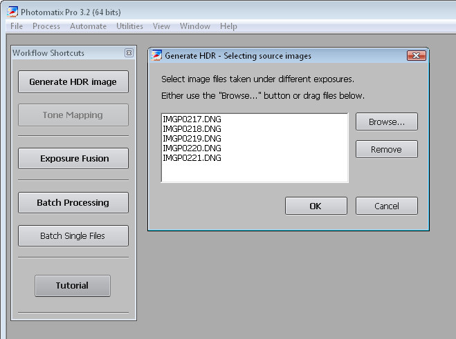

Step 1
Launch Photomatix Pro 3 and select Generate HDR image. Select your series of images and click ok. You can use three or more images and the program can read DNG files so you don't have to convert these first.
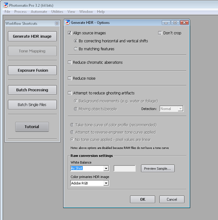

Step 2
In the dialog you can select to Align the images if you think there may be some movement and you can change the White Balance setting. You can also select to reduce ghosting artifacts which may occur if there is movement between images such as people walking.

Click Ok and wait as the processing is performed.
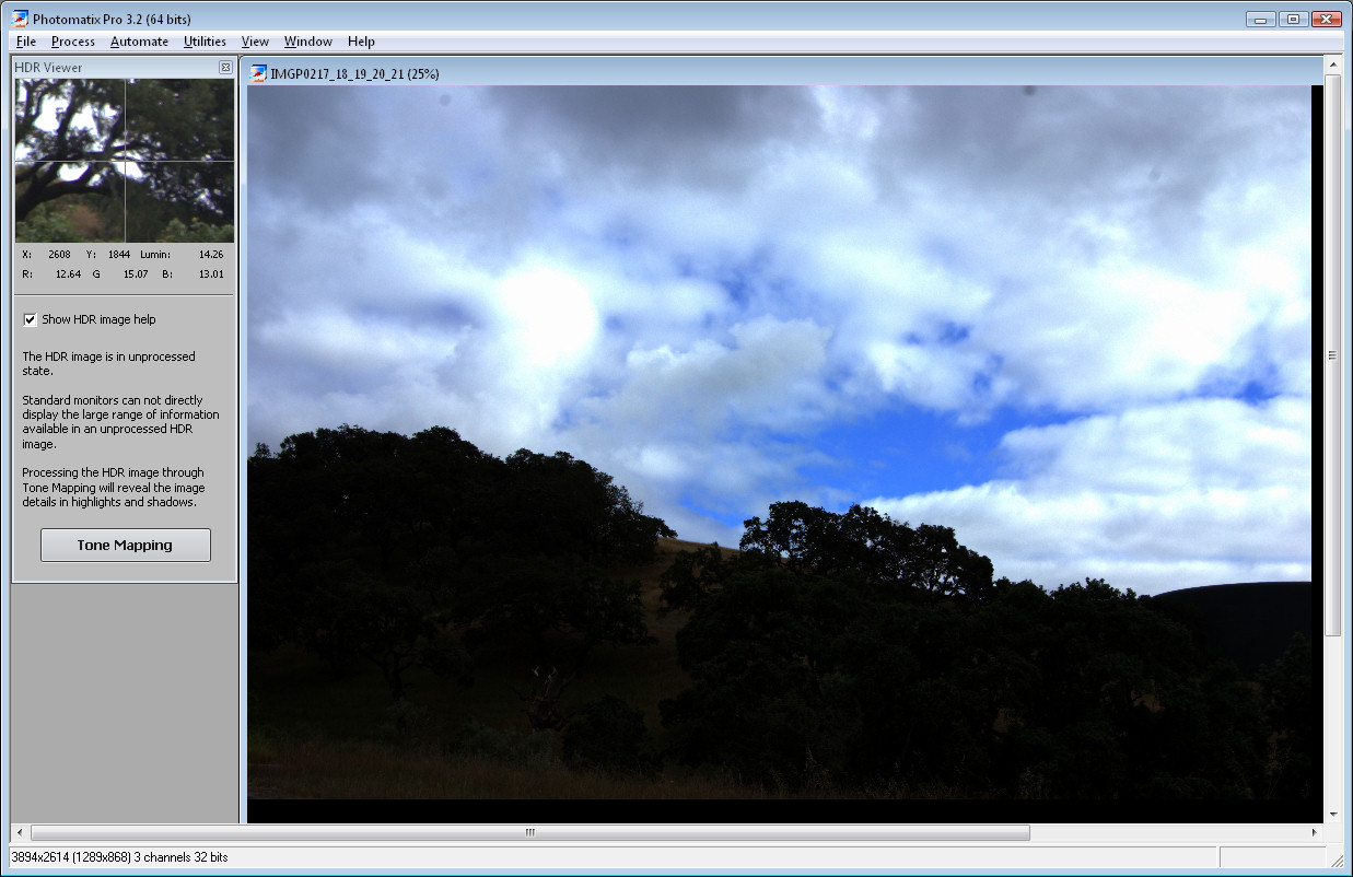

Step 3
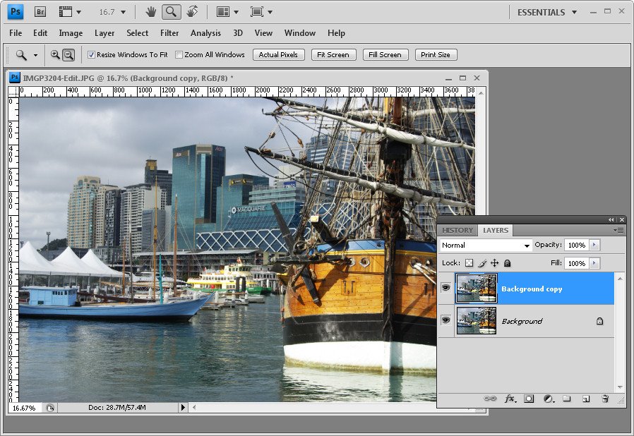
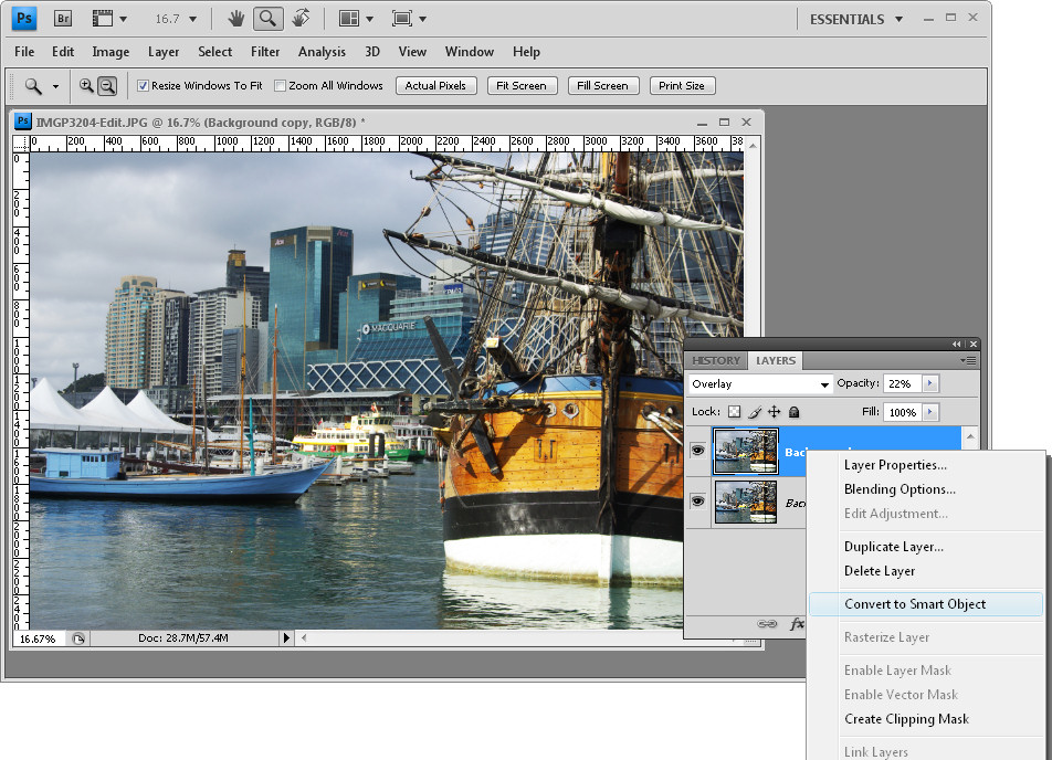
The resulting image won't look good and that's to be expected. You can save it at this point if desired by choosing File > Save As and save it as a .hdr image. You can later open this and work on it without having to generate the HDR version from the source images again.
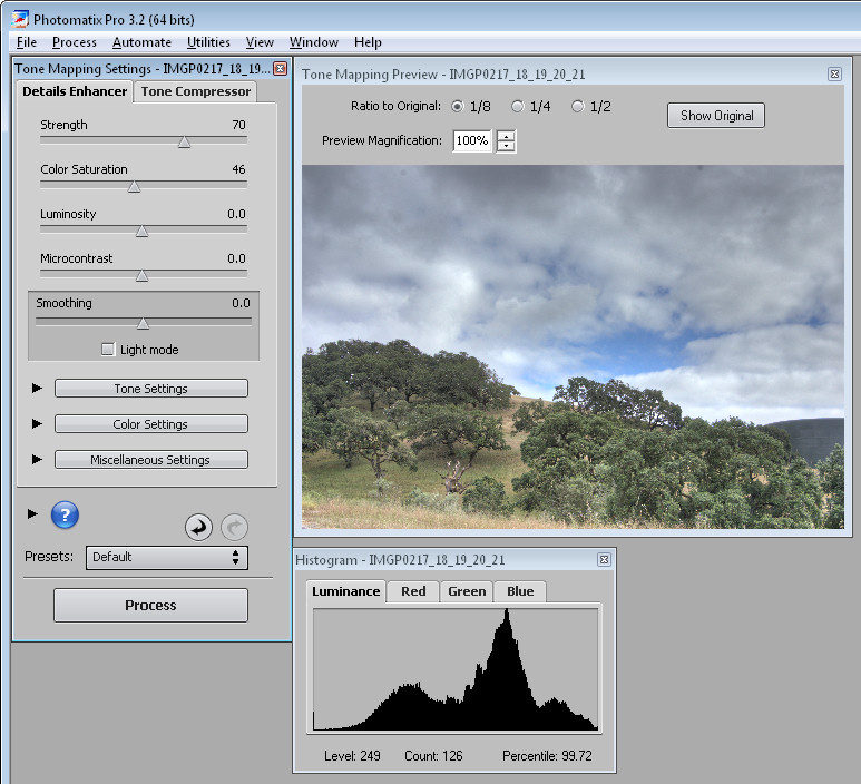

Step 4
Choose Tone Mapping and you'll begin to see the possibilities in the image. Click Show Original to compare the image with what you had previously. You should see enhanced detail in the shadows and in the highlights.
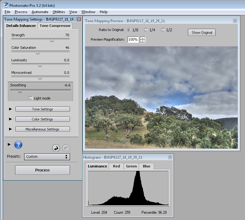
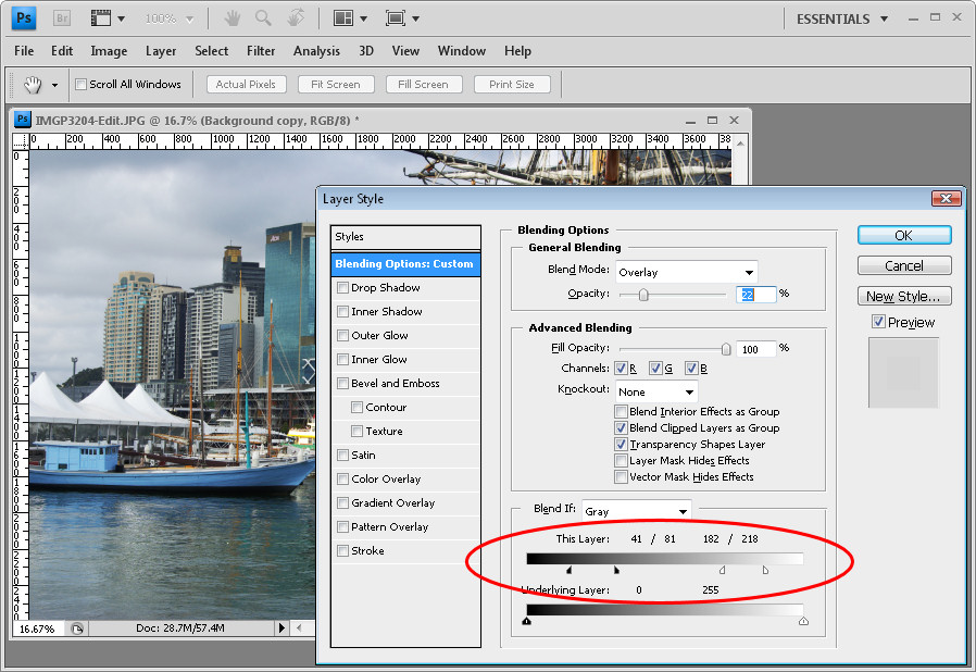

Step 5
To get a surreal effect, from the Smoothing options, select a low value - the lower the value the more surreal is the image and the higher the value the more realistic is the result. Adjusting the Strength downwards will also help you retain more realism if that's what you want.
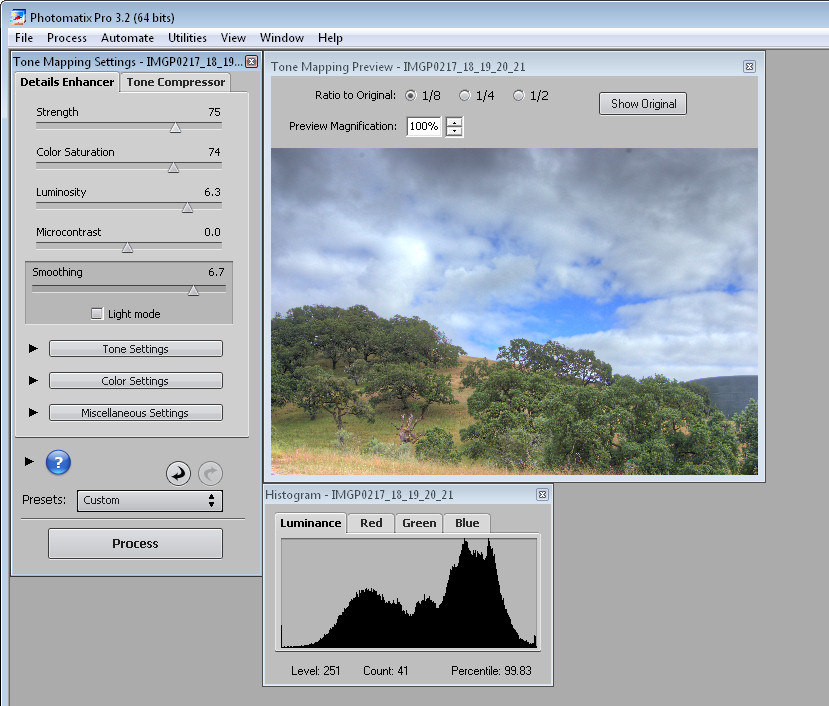

Step 6
Use the Color Saturation slider to adjust the saturation of the colors in the image and use Luminosity to adjust the overall lightness.
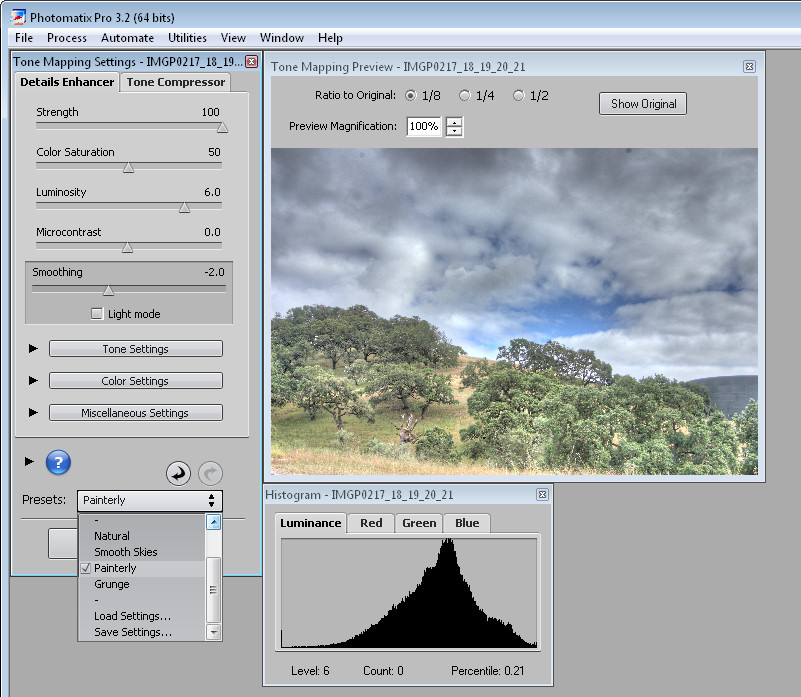

Step 7
There are also presets you can select from in the Presets dropdown list such as Painterly, Grunge, Natural and Smooth Skies.

Step 8
When you have an effect you like, click Process to process the image using the settings you chose.

When the finished image appears, choose File > Save As to save it and you can then open it in Photoshop or another editor to finish working on it.

Labels: , , ,

Saturday, October 24, 2009

Lightroom: Print with colored backgrounds


One issue with Lightroom is that all the images that you print from the print module print with white backgrounds.

While Lightroom does not offer color backgrounds for images, there is a workaround that you can use to print with any color background you like.

Here’s how to do this:


Start in Photoshop or another bitmap editor that lets you create and save JPG images. Create a new image the size of the page that you want to print.

For convenience, I'd create images for all the paper sizes you plan to use all at once. This means you may want one for 5 x 7" paper, one for 4 x 6" and one for Letter paper for example. Whatever size you print at, create a new image that size and at around 96 pixels per inch if you’re using a solid color background.


Fill the document that you have created with the color background that you want to use. For example, if you want a black background, fill the documents with black and for another color background, fill the document with that color.


If you typically use an Identity Plate to print your name or other details on the image in Lightroom then you'll need to know that what you’re doing right now is creating something that will replace the Identity Plate in Lightroom so you can't use both a background and a text identity plate.

However, if you know this ahead of time you can add the same details you add to your identity plate to this image as text.

If you plan to do this, you’ll will need separate documents for each paper size in each of the two orientations: Landscape and Portrait. If you’re just using plain backgrounds you won't need to create one in each orientation as you can rotate the images later on - you just won't want to rotate something that has text in it. You will probably want the images to be a better size for printing so 1500 x 1000 pixels will print on 6 x 4 paper at 250 dpi so the text will look crisp and neat.

Once you’ve created all your documents, save each with a name that indicates its size and color and, if relevant, its orientation. I suggest you save it somewhere that will make it easy to find and so they are safe from being removed accidentally.


Return to Lightroom and switch to the Print module. Set up your image or images to print. You can use a Contact Sheet/Grid layout or a Picture Package.

To add your background locate the Overlays panel on the right and click the Identity Plate checkbox. Click on the Identity Plate to display the menu and select Edit. When the Identity Plate Editor dialog opens, click the Use a graphical identity plate option and click Locate File.

Select the image that you created for this paper size (and orientation, if applicable), and click Choose. Click Ok to add the image as the Identity Plate.


When the image appears in the document set the scale to 100 so it fills the page layout and drag it into position.

You might notice that you cannot make the image any bigger than the page itself and you can't drag it out of its original aspect ratio - this is why you need to create multiple versions of the image one for each paper size as the ratios 8:10, 5:7 and 4:6 are all different.


Once you’ve dragged the background over the entire page, click the Render Behind Image option in the Overlays area.

This moves the solid color image behind the pictures on the page.

You can now change the stroke border if desired to, for example, add a white or gray stroke if you’re using a black or dark gray background.

Then go ahead and print your image.


You might realize by now that any image can be used as a print background.

So, for example, you can crop an image in Lightroom to the size that you need for the background, export it to disk as a JPG and then reimport it as an Identity Plate to use as a background for your printed images.

You could do this with a black and white version of an image or a color version. The Overlays > Identity Plate area also provides an Opacity slider allowing you to make the image partially opaque to lighten it so it doesn’t overwhelm the images you are printing.


When you are done, save your Identity Plate by clicking on the Identity Plate option, choose Edit and then from the custom dropdown list, choose Save As and save it so that it can be easily accessed next time.

Labels: , ,

Monday, October 19, 2009

Photoshop: Enhancing midtones


If you’re a Photoshop and Lightroom user you may, like me, love the Clarity adjustment in Lightroom and wish it were available in Photoshop too. The Clarity slider lets you adjust the contrast in the midtones of an image which gives an over all sharpening and color boost to the image midtones.

As yet, there is no Clarity tool in Photoshop (although there is one in Camera RAW). There is, however, a technique which has been popularized by Mac Holbert which does a similar thing. While the Photoshop technique is more cumbersome than using the Clarity slider in Lightroom it does work very well and gives very similar results.

Once you’ve performed the fix a couple of times you may want to create this as an Action so that you can run it on your images at any time you need to do boost the midtones.


Step 1
For an already flattened image, duplicate the background layer by right clicking it and choose Duplicate Layer.

For an image that already has multiple layers, click the topmost layer and press Ctrl + Alt + Shift + E to create a merged layer to work on.


Step 2
In the layers palette set the Blend Mode of this new top layer to Overlay and set its Opacity to somewhere around 20 to 25 percent.


Step 3
Select the Add a Layer Style button at the foot of the Layers palette and choose Blending Options.

In the Blend If section of the dialog, locate the This Layer slider. Drag the indicators under the slider in to approximately one-third of the width of this slider so you’re dividing it into thirds.

Hold the Alt key (Option on the Mac) to divide each slider into two pieces and position the outside halves at approximately the 1/6th mark, use the image as a guide.

The positioning of the sliders does not have to be exact. All you're doing here is removing the very lightest pixels and the very darkest pixels on this top layer from this fix, so it remains applied to the midtones only.

By splitting the sliders, you’re ensuring that there is a gradual change from where the effect is applied and not applied.


Step 4
If you’re using Photoshop CS3 or CS4, you can convert the topmost layer to a Smart Object before continuing. To do this, right click the top layer and choose Convert to Smart Object.


Step 5
Choose Filter > Other > High Pass and set the Radius to approximately 50 pixels. Click Ok.

The High Pass filter sharpens the image and the Overlay fix applies a contrast and saturation boost. The Blend If sliders ensure that the fix is applied only to the image midtones.


Step 6
Any of these adjustments can be changed. You can adjust the Radius of the High Pass filter to a larger or smaller value and, if desired, increase or decrease the layer Opacity to apply more or less of a contrast boost.

You can also adjust the Blend If sliders to apply the fix to a larger or smaller range of the image tones.

Labels: , ,

Friday, October 16, 2009

Lightroom - 10 objects you didn't know could be dragged, clicked or opened

If you’re new to Lightroom, there are a lot of interface options that you may not realize hide must know and handy program features. In this post, I’ll show you some of the buttons, icons, samplers and switches that a knowledge of Photoshop (at least versions prior to CS4) won't help you identify or locate.


1 Navigator
In the top left corner of the Library and Develop modules you'll see the Navigator. Beside it are the Fit, Fill, 1:1 and 3:1 options. Click these to resize the image in the current window to various sizes including fitting in the space, filling it and 1:1 and 3:1 resizing options. Other sizing ratios are available from the dropdown list.

The 1:1 ratio is particularly useful when you’re sharpening an image. You may already know that, when you hold the Alt key as you drag on the sharpening sliders the small preview image turns to a grayscale mask showing you the impact of the slider on the image.

If you are in 1:1 preview, the entire image acts as the preview, allowing you to focus in on a much larger area of the image and see the sharpening effect. 3:1 and other larger sizes also work but 1:1 is the minimum size


2 Switches
Switches in Lightroom appear in areas such as the Develop module where they can be used to enable or disable a setting such as the Tone Curve. Switch the switch to the up position to turn it on and to the down position to turn it off.

When using the Adjustments Brush the switch works from left to right to select to work with one fix at a time (Effect Buttons) or to work with multiple adjustments at once (Effect Sliders).


3 Arrows
In the Library > Keyword list panel, you can click the arrow to the right of a keyword to view images that have that keyword associated with them.

These arrows only appear when you are hovering over a keyword in the list.


4 Expand/Collapse Triangles
Throughout the Develop panel, for example, are small triangles beside the various options that you can click on to display or hide that option. For example, when Detail is not visible click its triangle and the detail panel will display.

There is another triangle directly below the Detail triangle which appears only when it is expanded. Click this to display and hide the sharpening preview dialog.

Watch out for these triangles - sometimes they aren't light gray and are, instead, almost black and difficult to see.


5 Area Picker
Also in the Detail area of the Develop module is a small square icon with lines radiating from it that you can click on and then click on an area of the image to determine what shows in the preview panel for the sharpening process. This icon has a visible tooltip which helps identify what it does - most do not.


6 Eyedropper
In the Develop panel’s Basic module is a white balance selector icon. Click it and click on an area of the image which should be white.

This adjusts the white balance of the image based on that selection. It also displays a small 25 x 25 pixel grid showing the pixels in the general area so that you can be more accurate in your selection.


7 Adjustment Markers
When you use the Adjustment Brush or the Graduated Filter, you will see a marker on the image which, when you click on it turns into a black circle surrounded by a lighter circle.

This marks the adjustment or the filter and you need to click this to select it before you can make alterations to the adjustment or to the filter.


8 Invisible clickable rotation options
In the Print module, watch out for items that don’t even look like they are selectable.

For example, in the Overlays > Identity Plate area when you have the identity plate enabled there is a small indicator to the right of it showing the current rotation in degrees.

If you click it you will see a popup menu offering other rotation options.


9 Way big buttons
Watch out for panels at the top of dialogs which can contain selectable options. For example, a dialog that has a large area like that shown in this image is often selectable offering different options but because it doesn’t look like a typical selectable option, it’s easy to overlook.


10 Direct Adjustment tool
In some areas such as the Tone Curve and Hue/Saturation Lightness in the Develop module you’ll see a small adjustment indicator in the top left of the panel area.

Click it and then drag on the image to change the image at that point.

While in Photoshop CS3 you would drag left to right to alter the sliders, in Lightroom you’ll typically drag up and down with this tool.

While these aren’t all the unusual buttons that you’ll find in Lightroom, it should help you understand that a lot of the features in Lightroom are hidden behind icons and buttons for which even a program like Photoshop is no adequate preparation for locating, understanding and using.

Labels: , ,

Tuesday, October 13, 2009

Highlight Color effect in Lightroom


One effect many people like to use with their photos is to remove all the color from the image and leave it in only one place in the image. For example, in a wedding shot you might turn the entire image into black and white leaving just the bride's bouquet in color.

Here's how to achieve this effect in Lightroom using the Adjustment Brush.


Start with the image selected in Lightroom and switch to the Develop module.

Click on the Adjustment Brush and make sure you have it set to Show Effect Sliders so that you can adjust multiple sliders at once. Drag the Saturation to -100.


Click the letter O so that you can see as you paint and with a large size hard paintbrush click on the image in an area you want converted to black and white and then paint over the image in all places that it should be turned to black and white.

It will be quicker if you set the feather to a low value, the brush to a large size and disable the Auto Mask option for now.


To work close around the edges of the area that you want to leave in color, set the brush size smaller and work slowly around the edges.

If you go too far, press the Alt key (Option on the Mac) and paint out the overlay color. The Eraser uses a different brush so make sure it too is set to have Auto Mask disabled and a low Feather value.

To zoom in click Z and to move the image, press the Spacebar as you drag on it.


Once you have the area selected that you want to convert to black and white, disable the overlay color by pressing the O key.

This leaves the selected area in black and white and the unselected area in color.

You can now tidy up the edges if necessary by using the Adjustment Brush tool - just make sure that you click on the marker for the Adjustment before you start painting - it should show a black center - if not, you're making a new adjustment and not editing the existing one.


You can adjust the other sliders, if desired, to improve the black and white portion of the image. For example you can boost the Contrast and Clarity if desired. When you're done, click the Close option at the foot of the panel to finish.

In this example I added another adjustment using the Adjustment Brush over the top of this one to reduce the exposure and brightness in the sky to add back some of the cloud detail lost in the conversion of the image to black and white.

Labels: , ,

Sunday, October 11, 2009

10 Photoshop interface features you didn't know existed


Here it is, short and sweet. 10 techniques for working in Photoshop that you may not know existed:


1 Open a file without using the menus
Simple. Double click the grey background area of the Photoshop window and the File Open dialog appears - magic!


2 If grey is dull, black is wonderful and any color is better!
To change the grey inside an image window from grey to black (or a color of your choice), Control + Right Click (Command + Right Click on the Mac) on the area surrounding the image and select a color.


3 Sample foreground and background colors
Instead of clicking on the foreground or background swatch to change the color to one sampled from the image, click the Eyedropper tool and click to sample a foreground color - hold Alt (Option on the Mac) to sample a new background color.


4 Position a shape or selection
When you’re drawing a shape or selection and the shape is fine but the position is wrong, keep hold of the mouse button and hold the spacebar as you move the shape or selection into the desired position. Let go the spacebar and continue to make your shape.


5 Get a selection back
If you’ve lost your selection, press Ctrl + Shift + D (Command + Shift + D on the Mac) to get it back. Ctrl + D (Command + D on the Mac) deselects the selection.


6 Hide and keep
If the selection marquee is getting in your way, Ctrl + H (Command + H on the Mac) will hide the selection but still leave it in place. Don’t forget to turn it back on or you might wonder why things aren't working the way you expect them to work.


7 See what you're working on
This is my all time biggest time saver! When you drag a large layer from one document to another you can view the entire layer and its sizing handles by Ctrl + Click (Command + Click on the Mac) on the layer thumbnail to select it. Then press Ctrl + T (Command + T on the Mac) to view the transform handles and Ctrl + 0 (zero) (or Command + 0 on the Mac) to shrink the image so the sizing handles are all visible.


8 Stack or line up palettes
To stack palettes side by side in the same dialog, drag one palette over the others until a blue line appears around it and let go. To stack palettes one on top of the other down the screen, drag and drop one palette onto the bar just above another palette’s name.


9 No dialog Reset button? Yes there is!
You can reset most Photoshop dialogs to their original settings or at least some version of the original settings by holding the Alt key (Option on the Mac) when inside the dialog - when you do this, the Cancel button turns into a Reset button.


10 May all your ellipses turn into circles
To draw a circle using the Elliptical marquee or a circle shape, hold the Shift key once you’ve started drawing and the ellipse will become a circle. To draw from the center out, hold the Alt key (Option on the Mac) as you start drawing an ellipse, then add the Shift key to make it a circle - keep holding both keys until you let go the right mouse button.

Labels: