Articles | Photography Blog | Office Tips Blog | about me | e-mail

Helen Bradley - Photoshop and Lightroom tips and techniques

Monday, October 29, 2007

Paris in Autumn


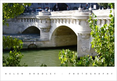
This photo of a bridge over the Seine shows one of the wonderful doors at river level. You have to wonder where they would have lead to?

It was a beautiful time of the year to be there. The trees were just turning and the weather was wonderful. I have a series of people sunbathing along the Seine to come, they're great images and so Parisienne.

Labels:

Friday, October 26, 2007

Boats on the Seine


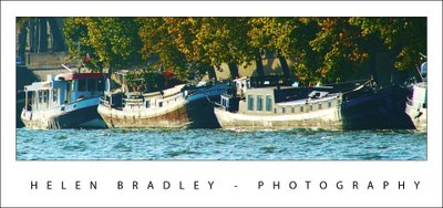
I went on a lot of boat rides in my 10 days in London and Paris. My dad was a sailor and a love of water flows in my blood alongside the bits and bytes. This photo is from one of the trips in Paris, the horror ride in the boat on the Seine (see below for more details).

This image nearly defeated me. It is a big crop - what is left is under a quarter of the original image. It wasn't particularly in focus and the color was awful - for this read dirty grey - the boats had the sun hitting their sides so the color is washed out.

I did some fancy work with Curves to get the color out of the image. I over adjusted the colours very harshly and then blended a couple of versions of the image back into itself. The result is pretty good and I think the image has some charm and that's why it's here.

It really was a beautiful afternoon in Paris.

Labels: , , , ,

Thursday, October 25, 2007

The beauty of Paris


I just adored Paris. I recognised my love of the city as I flicked through the photos I had taken there - at least some of them - there are thousands.

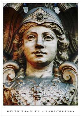
This is one of them. The sculpture itself isn't notable, it's just a small piece from above a doorway in some Parisienne backstreet. Yet it's part of what is magic about Paris - there is so much there - more than you could take in in a lifetime.

This picture underwent a simple Levels adjustment to bring up some of the contrast and then a huge Curves attack to bring some colour into it. I totally abused the Curves dialog and the image gave up its magic. I actually blame Dan Margulis for this. Yesterday I watched one of his Man from Mars videos and I just couldn't resit applying the technique to this image and it gave wonderful results. Thanks Dan!

You can find Dan's video at Peachpit (along with some of my own Photoshop articles and videos). It's a huge download - around 90Mb but, believe me, it's worth every bit of it. Don't blame me if you fall in love with the Curves adjustment as a result of watching it. Then, when you're done, treat yourself to one of his LAB colour videos - it's almost better than chocolate! And, add to your Christmas wish list his wonderful book Photoshop LAB Color: The Canyon Conundrum and Other Adventures in the Most Powerful Colorspace.

Labels: , , , ,

Wednesday, October 24, 2007

Port de Vanves market - Paris


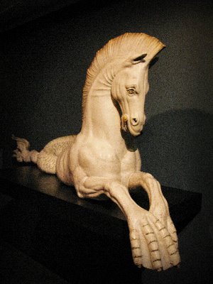
We visited the Port de Vanves market in Paris. This funky market only happens on a Saturday and Sunday morning from 7:30am till around 1:30pm. It is really near a Metro station (tell me what isn't in Paris!) and it's not on the tourist beat so it's more French than you might expect. It was so much fun and I bought lots of little bits and bobs for my artwork. My mum bought me this cute paper mache horse which is hand made and which is on little wooden wheels - way too cute.

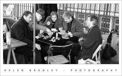
These five guys were stall holders who were taking time out to grab some lunch. They were so wonderful and kind to let me capture this photo.

This photo is a compilation of two I took. I aligned them using the new Photoshop Auto Align layers command and then masked out the bits I didn't want from the top layer. This let me use the best facial expressions for each person. I used the - new to Photoshop CS3 - Black and White adjustment layer to mix the black and white because this gives you the ability to select colours in the image and take them to black or white. The result is much richer image than I could create with, for example, the Hue/Saturation tool or even the Channel Mixer.

Labels: , ,

Tuesday, October 23, 2007

More color - because I just can't resist it


Here's another of my Paris images. I had to drag color out of this image, kicking and screaming using the Curves feature. Problem was, all the Curves and levels caused grief with the light in the bottom right. I loved this light and it has a wonderful shape so I was bummed to see it as a big black blob.

So, back to the image, I corrected it separately for the light and then masked various portions of it until I had the best of both worlds - the light and the rest, sort of like having your cake and eating it too... kinda brings poor ol' Marie Antoinette to mind doesn't it? You know.. Paris, the revolution..

Labels: , , ,

Monmartre - in color


One thing I love doing to photos is to mess around with the color. This photo was ripe for it and I dragged heaps of color out of the image and then worked to blend and tone it back down until I had a look I really liked.

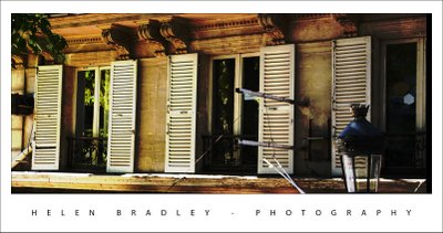
The building is just by Abbesses Metro station in Montmartre, Paris. The station itself has the original Art Nouveau signage and canopy and it has a huge spiral staircase which is covered in art going up and photography going down - ask me, I climbed it and photographed every step of the way up and down. This building is just across the road from the station and it's gorgeous. It's a photographer's delight and very, very French.

If you look really close you'll even see a face and hands painted onto the face of the building.

Labels: , , , ,

Monday, October 22, 2007

Seagull at Brighton


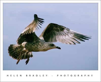
As soon as I saw this image in the LCD screen on my Pentax *ist DS I knew I had a great shot. My only hope was that it would be in focus as it was a big ask to get the shot in focus as the bird flew in. After all, I could hardly ask it to hold the position or go back and do it again!

All the shot needed was some cropping and a little contrast enhancement. It's one of those photos that keeps you coming back and taking more photos.

It's a photo I'm proud to add to my Helen Bradley - Photography collection.

Labels: , ,

Friday, October 19, 2007

4 Bridges - Paris


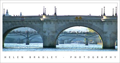
This photo was taken during a trip on the Seine on a boat. The circumstances were about the worst you could imagine for photography. Four hundred people jammed into a boat which was enclosed mostly by glass and steaming into the sun on a very smoggy Paris afternoon. Great.. the temptation was to put the camera away and start drinking - the effort of trying to take any photo at all was almost too much. My only clear view was out the side of the boat, past a very active four year old and her long suffering mother. It wasn't my ideal "boat ride for taking photos", but it came included in the Paris Pass and who knew it would be this horrible?

Like the intrepid photographer I am, however, I persisted and I did get some usable photos, albeit ones that required a bit of help. Like this one taken out the front of the boat through about half an inch of scratched Perspex.

It is a view through four of the wonderful Paris bridges that we sailed through. The photo needed a lot of work. I gave the sky a miss - it just wasn't there and, in the final analysis, I think the image is all the better for it not even being there. The biggest challenge was to extract some of the usable color and detail from the original image. It was autumn in Paris so there were hints of golden trees in the image which deserved to be brought out and the bridges were what it was all about. The mere fact that you could see all four bridges was spectacular.

I started the work by straightening the image – I find I can’t work on an image until I have it straight, it just bothers my eye when it’s out of square. To do this, I use the Photoshop Ruler tool to draw a line along the horizon or a vertical object that needs to be perpendicular. Then I choose Image, Rotate Canvas, Arbitrary. The exact angle from the Ruler is already there so all you have to do is click Ok. It’s simple and effective. For this image I used the top of the bridge as a ‘horizon’.

A few tricks with Levels and curves and the image gave up its magic and turned into what you see here. It’s one of my favourite shots – so far.

Thursday, October 18, 2007

Brighton Pier


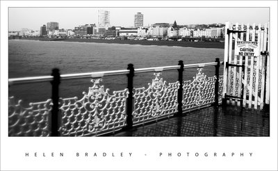
Oh wow. I had all these photos of Brighton Pier. It was raining cats and dogs when I got there so I had to shoot everything with water dripping down my neck and trying desparately to keep water off the camera.

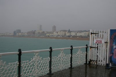
I though I'd probably lost out on good shots. Not so! A little fix here and there and I have some great results. I love this Caution, No Entry one. I had to adjust this image twice, once to bring in the pier and water/buildings detail and a second time to get the reflections in the timber pier flooring. I used a mask to bring in the bits I wanted to use. You wouldn't believe what I started with and how far it came, so - just in case you're interested, here's a preview of the starting image:

Labels: , ,

Shopping for books by the Seine - No 2


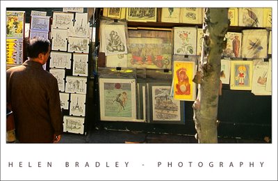
I took yesterday's image and decided I wanted to look at it another way. So, I cropped it horizontally this time and worked a lot with the colors. I wanted not only to crisp it up but to punch some of the colors.

I'm working on some notes from Dan Margulis from Photoshop World in Las Vegas - his 5 minutes to a picture postcard class.

One of the great tricks I learned there is using the Luminosity channel to add punch to a photo. The idea is to duplicate the main layer in the image and then select this duplicate layer. Then use the Apply Image command. It's a command most people don't use because it's so damn obscure but I've used it quite a bit before and I love it. Here you apply a channel such as the Red, Green or Blue to the image but, after you've done this, instead of accepting the default blend mode in the Layers palette - which is Normal and which makes the image Greyscale, you use the Luminosity blend mode to take the contrast but drop the color.

It's a great tool - it's only one of Dan's tricks but it is fun to play with. Use the Green channel for portraits and the red channel for skies.

I did a lot to this image to try and recover and enhance the color. I started out by balancing the color to remove the cast. Then used a range of tools including curves and apply image to try to punch up the color.

I quite like the result.

Labels: , ,

Paris - by the Seine


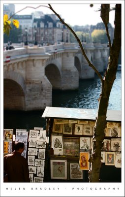
There are beautiful little boxes all along the Seine where they sell books and manuscripts and old post cards. A sunny Autumn afternoon is just the place to stroll and find some "must have" item.

This photo underwent radical surgery. It is two photos blended together using Photoshop CS3's new Auto Align layers and Auto blend layers tools. To do this, add one image's background layer to the other. Select both layers and you'll find the commands on the Edit menu. I did Auto align first. You might want to experiment with which layer you use as your topmost layer as the results differ. Then I did Auto Blend which makes a mask on each layer to bring in the bits it thinks you want from each layer. Remember you can click a mask to select it and then paint with white or black as required to reveal or hide detail on that layer - I did this as I wanted the guy in the image but needed to remove the other people who were in the originals.

Then I made a composite merged layer with my fave command CONTROL + ALT + SHIFT + E (Command + Option + Shift + E on the Mac). This gave me an image to work on the colors with. I'll talk more about how to do that in another post.

Finally, to bring the attention to the bottom of the image (rather than the top), I created yet another merged layer, duplicated this and blurred the topmost layer. On the top layer I added a mask and a gradient fill using the Foreground to Background gradient. This resulted in the top of the image being nicely blurred and leaving the bottom in focus. I also picked out the tree and added it to the mask so it would be more in focus as it's in the front of the image.

Finally, I added the small black border which defines the edge of the photo. To do this, choose Select, All and then Edit, Stroke and add a small 2 pixel black stroke around the Inside of the image. Add the white photo edge, the text and another small black border around the lot.

Sounds like a lot of work but once you've done it a few times it all happens pretty quickly. The worst part was the color correction as it is a bit fiddly.

Labels: , ,

Gotta love Paris


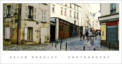
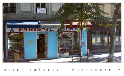
This photo captured me because of the shop's wonderful name and the blue and red colours. It's unexpected and funky.

The fixes included cropping it to remove excess and unwanted detail and colour correcting it to boost the colours in it. I also duplicated the final image layer, blurred the top layer then used a mask filled with a white to black gradient across the image to blur the right edge of the photo. I needed to also paint onto the mask to bring the tree back into focus.

It's proof that even funky shots that you don't think will amount to much can be great if you give them a chance to shine. I also love short wide crops.

Labels: , ,

Where did my Photoshop cursor go?


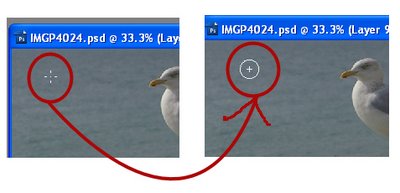
Ok. So this morning I went to do some work on my images from my trip and my Photoshop cursor went missing. All I had was a funky little cross hair thingie. It's not a machine I use a lot so I thought it was just that the brush hadn't been set correctly. Into Edit, Preferences and - well, all the brush settings look ok. So I try another brush option just in case. Same problem. Not good.

The solution is, luckily very simple. When you know how. It's just a matter of pressing the Caps lock key. In fact, I suggest you do it right now so you know how it works. Choose a brush tip and press the Caps Lock key - voila, your cursor changes and disappears. Press it again and it comes back. That's what happens, your Caps lock key toggles the brush tip display. So, when your brush tip goes west and you can't see it so you have no idea how big it is or pretty much where it is, the Caps lock key is about to become your new best friend. Promise.

Labels: , , ,

Wednesday, October 17, 2007

Early morning Paris style


I've just returned from 10 days in Paris, London and the surprisingly wonderful Brighton.

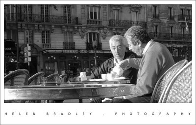
I plan to display some of my photos as I fixed and work with them. Today, it's two gentlemen at the cafe I stopped at for a Cafe Creme every morning in Montparnasse. This is the essence of what Paris means to me. Lazy mornings sipping great coffee. I will never again make the mistake of imagining for one minute that Starbucks has anything at all to do with good coffee!

The photo is pretty much unedited. It has been converted to black and white, straightened and cropped but that's about it.

Labels: , , ,

Tuesday, October 16, 2007

10 Top Flash Photography Tips


Your camera’s flash can be the best tool you have for lighting a shot or the best tool you have for destroying an image - it all depends on how you use it and when. In these tips I will show you how you can tame your camera’s flash and make sure that it works for you and not against you. As you read you might be surprised to learn when you should be using your flash and when you’re better advised to turn it off and take the shot without it.

Learn to control the flash
The first step to working with the flash on your camera is to learn how to configure it so you can, in an instant, turn it on or off as required. Consult your camera’s manual and learn how to read the indicators on your camera which tell you the current status of the flash. You should be able to turn the flash off so that it does not fire even in low light conditions and you should be able to enable it so that it fires even in full sun. These skills are essential for taking good photographs.


Avoiding redeye
One technique typically used to avoid redeye is to turn on the camera’s redeye reduction flash. This option fires a small flash before the full strength flash and this has the effect of shrinking the pupil size so that the redeye effect is less likely to occur. Unfortunately it also has the effect of misleading your subject into thinking that the photograph has been taken so that they feel free to move and the resulting shot is inevitably blurry.

Rather than using the redeye reduction flash I suggest you disable it and, instead, use other means to reduce redeye. To avoid the redeye issue without the using the redeye reduction flash make sure that the lights in the situation in which you are using the flash are turned up as high as they can be. With good room lighting your subject’s eyes will be less likely to be red. An externally mounted flash can also help - see tip 5 below. Of course, if all else fails you can remove the redeye effect in your digital photo software and many printers and photo services can also remove it.


Understand its limits
If you’ve ever been to a sporting event at night you will have seen people high up in the grandstands using their camera’s flash to take a photograph of the action below. This is the least effective way to capture a good photograph. Your camera’s flash has a range of about 9 feet which makes it of no use at all in a sporting situation.

Next time you’re at the game, turn off your camera’s flash and switch the camera to night mode so that it understands that more light will be needed to take the shot. Brace yourself carefully using a tripod if you have one and then take the shot without the flash. The result will be a much better photograph.


Use the fill flash
It might seem counterintuitive to use a flash when taking a photo in bright sunlight but it is one time you really need the power of your flash. Consider the situation where you have your child in front of you on the beach and a beautiful sunny beachscape behind them. If you take a photograph of the child without using the camera’s flash your child will be in deep shadow with the beach scene behind him or her perfectly exposed. On the other hand if you use the camera’s main flash or its fill flash if it has a special flash for this purpose, you’ll get both your child and the beach scene perfectly exposed. Any time you are shooting in bright sunlight where your subject is within flash range you should use your flash to light them correctly.

Another use for the fill flash is where your subject is lit very strongly from one side such as where they are standing by a sunlit window. Using the flash will even out the deep shadows on the other side of their face giving you a more evenly lit portrait.


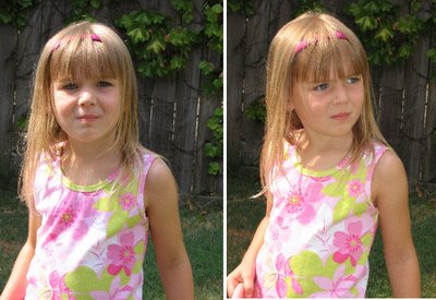
The photo on the left is shot without the flash, on the right, the fill flash adds delicate color to the child’s face and evens out the sun’s harsh shadows.


Off camera flash
Many cameras, in particular digital SLR cameras, have the ability for you to mount an off camera flash. This flash can either be hand held or mounted to a hot shoe connector on the top of the camera. These special flash mounts raise the flash bulb a few inches above the camera and offer you the ability to angle the flash head so it doesn’t fire direct into your subject’s face.

If you are photographing indoors with a flash mounted on your camera, angle the flash so it fires off the ceiling with the result that the scene will be bathed with light. You may need to make a small adjustment to your camera to allow a little more light into the shot to compensate for not having quite as much light available as you would if the flash fires direct into your subject’s face but the resulting image will be much more flattering and you’re unlikely to encounter a problem with redeye.


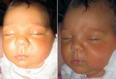
The photo on the left is shot with a regular flash direct at the subject, the one on the right has the light bounced well away from the subject.

Create a silhouette
If you have a beautiful sunset in front of you and a person standing in front of it between the sunset and the camera there is a temptation to use the camera’s flash to light the person and also capture the sunset. If you plan to do this, make sure you choose a long exposure so you get plenty of the sunset in your photo as well as your subject. On the other hand you can capture an equally interesting image by turning off the flash and adjusting the exposure to -1 or -2 to slightly underexpose the image. Now capture the sunset and you will find that your subject is a dark outline silhouetted against the brighter sunset.


Instant color correction
If you are shooting indoors where fluorescent or incandescent lights are creating a color cast you can avoid the cast and color balance your image using your flash. The light from your camera’s flash is a more neutral light and free of unsightly color casts, so firing the flash indoors will light the scene with the clean flashlight and reduce the colorizing effect of the light bulbs. You don’t need to turn the lights off because the flashlight will be strong enough to neutralize them.


Flash not allowed
When you encounter a situation where you are not allowed to use flash photography but there is no ban on taking photographs then you’ll need to understand how to compensate for not having a flash. Disable the flash on your camera and try a few test shots to see if the lighting is sufficient to take the photograph. Increasing the ISO equivalency on the camera so that you are shooting with 200, 400, 800 or higher ISO will capture more light for the same shutter speed. in a dark situation. The downside of this is that you will have a more grainy photo as a result. You can also experiment with a slower shutter speed but you will need to strike a balance between speed and the likelihood of movement marring your shots. The longer the camera takes to capture the image, the more light it will capture but, in consequence, any movement will result in an unsatisfactory blur in your images.


When you’re in the situation of not being allowed flash photography a long exposure can help you get the shot you’re after.

Diffusing the flash
The flash on a point and shoot camera can be very harsh and you might find it washes out your subjects because it is just too strong. To get a more even lighting effect, diffuse the flash by placing something in front of it. For example semi-opaque sticky tape placed over the flash will help diffuse the light as will a small sheet of wax paper held in front of it or taped over it. Another option is to hold a piece of shiny white card underneath the flash angled slightly up so that you bounce the light from the flash upwards to create a more diffused light.


Creative flash
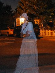
Your flash is more than a simple lighting source and it can be used for creative purposes too. If you set your camera to a long exposure to take a night shot with the flash turned off you will capture elements like car lights as streaks on your photo. On the other hand if you use the same long exposure with a flash you can capture a subject close by with the flash and then capture the movement behind the subject with the longer exposure. If you are working with a human subject ask them to stay very still throughout the entire shot well past when the flash is fired. Alternatively if the person moves you will get an interesting ghostlike effect on your photos. Of all the tools in your camera the flash can give you some of the best creative opportunities but it will help if you spend some time experimenting with it before you need to use it in a practical situation.


This ghostly Halloween image was created using a flash combined with a long exposure.

Used correctly, the flash on your camera can be a great addition to your photography allowing you to take beautifully lit portraits in even the harshest of light conditions and to capture interesting and creative images.

Labels:

Monday, October 01, 2007

Read the &%*^$# Manual!


The ins and outs of Camera Manuals

When your camera’s manual is inches thick and looks like it’s written in a foreign language, Helen Bradley has some sage advice.

When you first purchase a digital camera you’ll be anxious to open the box and get started. If you’re like many people you’ll be putting the camera manual to one side because it’s just too thick and too complicated to deal with. However, the manual contains lots of valuable information and, when you're able to sift out the useable details from the information you don’t currently need, it can be a good resource for taking better pictures. So what’s important information to look out for and what can you skip for now? I'll show you what's what and why you need it.

Configuring Image Size and Quality
When you purchase a digital camera one of the key selling points will been the number of Megapixels that the camera is capable of capturing. The larger the number of megapixels, the larger the images can potentially be – they will be wider and higher than images from a camera that has a lower megapixel value. Depending on what you intend to use your photos for, you may not need to use your camera at the maximum possible image size.

In fact, you may prefer to reduce the size to make handling the photographs easier and so you can store more photos on your camera card. So, if your camera can capture more than 4 Megapixels of data and, if the main purpose of your photography is to print 4 x 6 or 5 x 7 images and to be able to email and share them with friends, consider reducing the size of the images. Check your camera manual to see what size options it offers and how to set the camera to a smaller size image.

Another issue to consider is image quality. Because captured images take up so much room, most cameras will compress the image data so that more images can be stored on the camera’s card. While it may makes good sense to reduce the overall size of the images that you capture if you don't need them to be very large, selecting a lower quality of image is not generally advisable – you'll still want high quality images even if they are smaller. Check the camera’s manual to see what compression alternatives are available and configure the camera so that the highest possible quality (the lowest possible compression) is used. Now, even if you are shooting smaller images, you will still maintain the highest possible quality in those images.

If your camera has the option to capture Camera Raw format images, consider whether you really want to be processing Camera Raw images. Unless you have a graphics program capable of handling Camera Raw images and unless you understand the implications - for example that these images cannot be shared easily with others or displayed on the web without being converted to another format - it may be preferable to shoot and store images in another format for example JPG which is more easily managed.

Configure White Balance


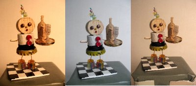
This object has been photographed with a range of white balance settings. As you can see the different settings result some strong color casts being present.

Most digital cameras have configuration settings available for White Balance. The white balance adjustment is required because light is different in color in different circumstances and the white balance adjustment allows you to compensate for this color change. For example, sunlight is much warmer and bluer than the light that you will see when the sky is cloudy or overcast. In addition, indoor light from incandescent globes is a different and more yellow color than either sunlight or the blue/white color that is given off by fluorescent tubes. Configuring your camera’s white balance to the type of light that you are shooting in will ensure that your images do not have a distinct color cast that you'll have to fix later on.

Setting the ISO
When you shoot with film camera you may have been aware that there are different film speeds which are indicated by the film's ISO number. Typically you will have used ISO 100 to 400 speed film in most point and shoot cameras. ISO 400 film is fast and can freeze action easily but the downside is that it is grainer so the images have a more distinct film grain. ISO 100 is slow film so the images are less grainy but the camera will need to let in more light to capture the shot so this film is not as good for shooting fast action on a cloudy day or shooting in low light.

Most digital cameras have ISO equivalent settings allowing you to choose an ISO equivalent speed when you're shooting using manual settings. Check your camera’s manual and, when you are shooting on a bright sunny day, use ISO 50, 100, or 200 equivalency on your camera. In low light or on cloudy days, you can set the value to 400 or higher. If you are using the automatic setting on your camera, your camera will probably make an ISO choice when taking the shot, but when you set the aperture and speed yourself using the manual settings on the camera, this ISO equivalency setting will impact shot you take.

Understand Fill Flash
When shooting a person in front of a landscape or seascape on a bright sunny day, you are well advised to use the fill flash. This lights the subject, ensuring that they are captured clearly as well as the lighter background.

Your camera will, most likely, have a variety of flash settings and it's important you know how to identify and use them. Look for Automatic flash which leaves the choice to the camera to determine whether the flash should fire or not; No Flash where the camera is prevented from firing the flash even in circumstances where it is required, and Fill or Forced Flash which forces the camera into firing the flash.

Adjusting Exposure


The central photo is taking using the standard exposure, those on the right are reduced 1 & 2 stops and those on the left increased 1 & 2 stops.

Most digital cameras have an exposure control which allows you to override the calculated exposure and to increase or decrease the exposure by one or two stops. Increasing the exposure will lighten the subject giving an overall lighter image. If the images you are capturing are too bright, then decrease the exposure by a stop or a fraction of a stop and the image captured will be a little darker than usual. In general, these exposure controls can be used in conjunction with the automatic focusing and shooting features of the camera.

Other Camera features
There are many other things that your camera manual can tell you about your camera. For example, your camera may be able to shoot in black and white or in sepia mode – this saves you having to convert the image in your graphics software – but remember it's not reversible so you can't put the color back in.

You may also find that your camera includes a video option for shooting short video clips. Don't count on this feature as an alternative to shooting still shots or as an alternative to using a camcorder, but it is a fun tool to use for short clips. It is also possible using some software to extract still images from the video clips – although the quality won't usually be as good as taking still images.

Look also for an explanation of the built in modes that your camera offers for shooting in a variety of situations. Learn how to set up and use night shooting mode, sports mode, landscape and portrait modes. If your camera has manual settings for aperture and speed, read how to set these up to get better control of your shots.

Other options to look for are for the ability to display a slide show with the contents of your camera card on a television. In this case, you will need to configure the camera for NTSC output to match the format of your TV.

Some cameras can help you shoot shots to make a panorama and can even stitch the images for you. You may also find options for automatically rotating images inside the camera (handy if you're planning to play a slide show on the TV), for adjusting the strength of the flash output, configuring file names, locking photos so you can't accidentally delete them etc..

When to study the manual
Your camera's manual is a tool that is worthwhile reading when you first buy your camera to establish how to configure it for your basic needs – on/off, inserting and removing cards and batteries. Revisit the camera manual in a month’s time and you’ll be ready to learn more about what the camera offers. Again after a few months more, have another look at the camera manual. The basics will now be familiar to you and you’ll be ready to delve into some of the camera’s more advanced features. Practice your new found skills and knowledge to ensure that you are getting the maximum value from your purchase.