Articles | Photography Blog | Office Tips Blog | about me | e-mail

Helen Bradley - Photoshop and Lightroom tips and techniques

Friday, July 31, 2009

Create Silhouettes in Photoshop

One feature you’ll see a lot in advertising is silhouetted images generally of people or recognisable buildings. Here's how to capture and create a silhouette image:

To capture a photo to use as a silhouette place the subject so they are backlit. You can do this easily by positioning your subject between your camera and the sun.

You’ll need an area that is clear behind the subject so that you can cut the shape from the photo later on. You can do this on the beach in summer or find a location where you can get down low enough to shoot from and so you capture some clear sky behind the subject.

The cleaner the background the easier it will be to isolate the subject.
I shot my image from ground level looking upwards late in the afternoon with my model in shadow but with plenty of clear sky behind her.

To create the silhouette
Step 1
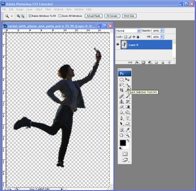
Open a duplicate of your image and double click the background layer to convert it to a regular layer.

Make a selection around your subject using your favourite selection tool such as the Magnetic Lasso or Quick Selection tool.

Choose Select > Invert to invert the selection and press Delete to remove it.
Step 2
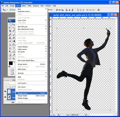
Tidy up the selection by removing any remaining background or add missing elements by selecting, copying and pasting pieces in from elsewhere in the image.

Don’t worry about matching colours – just get the outline right.

Choose Layer > Merge Layers to merge the layers. Here I copied and pasted one leg to create the one I was missing.

Step 3
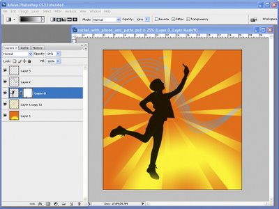
Control + Click on the layer that contains the shape that will become your silhouette.

Set the foreground colour to black and press Alt + Backspace to fill the silhouette shape with black. Add the extra details to finish your image.

In a future post I'll explain how to create the sunburst shape.

Saturday, July 25, 2009

Photoshop: Create an overlay of TV scan lines


Photoshop has a great tool for creating patterns which – on the face of it - is of little use to the average photographer. That is, until you begin to explore its creative possibilities and one of these is creating an overlay of lines on your image, much as you might see on a photo captured from a TV.

I'll show you how to create a line pattern, how to apply it as an overlay on the image and then how to blend it into your photo for a creative effect.


Step 1
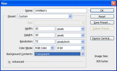
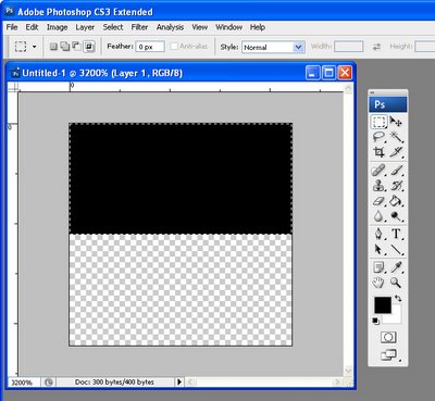
To create the pattern for the lines, start with a new Photoshop document that has a Transparent background and that is, say, 10 by 10 pixels in size.


Step 2
Set the foreground color to black. Zoom in to the image and select the top half of the square. Now press Alt + Backspace (Option + Backspace on the Mac) to fill the selection with the foreground color.


Step 3
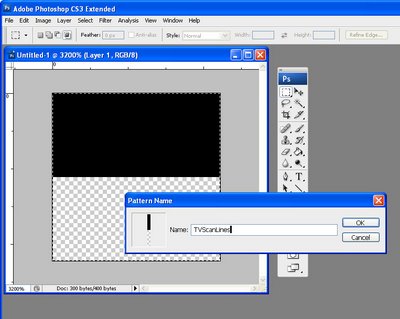
Select the image by choosing Select > All – you must select both the black and the transparent portions as together they are your pattern. Choose Edit > Define Pattern and type a name for your pattern – call it TVScanLines or something similar and click OK. Close the image.


Step 4
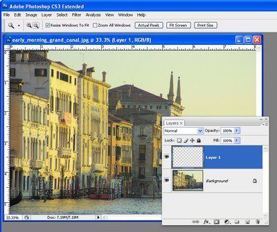
Open the image to add your scan lines to. Add a new layer for the lines by choosing Layer > New > Layer and click Ok.


Step 5
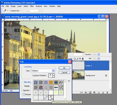
To fill the layer with the scan lines, choose Edit > Fill and, from the Use list, choose Pattern and open the Custom Pattern swatch. Your pattern will be the last in the list so click it and click Ok to fill the new layer with the pattern.


Step 6
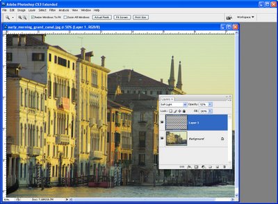
Select a Blend Mode from the Blend Mode dropdown list – something like Overlay or Soft Light generally works well. Reduce the Opacity until you get a result you like.

For this image I chose Soft Light blend mode and set the Opacity to 52%.

Tips
In step 4 you can select an area on the image and then apply the scan lines to only a portion of the image.

While this pattern isn't so complex that it would be a nuisance to have to recreate it, many of your patterns may be more complex. To save a pattern choose Edit > Preset Manager and select the Patterns from the Preset Type dropdown list. Select the Patterns you have created and click Save Set to save them as a file on disk so you can load them again if you lose them.

Horizontal lines are not the only pattern you can use for this effect – try creating a pattern of diagonal or vertical lines or create a checkerboard one.

This process works exactly the same way in Photoshop Elements.

Ready to learn more? Here are links to two more fun and creative Photoshop tutorials:
Orton Effect in Photoshop

Make your own Photoshop brushes

Labels: , ,

Wednesday, July 22, 2009

Photoshop does Merge to HDR


While Photoshop’s HDR merge tools are not as sophisticated as those of, for example, Photomatrix Pro, if you have Photoshop then you can use the merge to HDR option to create an HDR image from multiple exposures that you have taken of a scene.

You'll need 3 or more images all at different exposures. I used 5 for the example shown here and all were shot using a tripod with IS turned off!.

Here's how to assemble the images in Photoshop:


Step 1
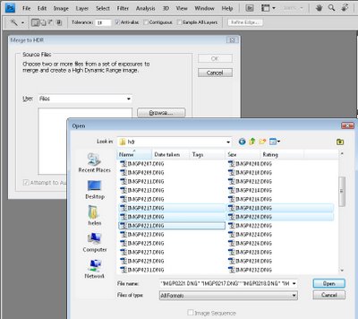
Choose File > Automate > Merge to HDR and click Browse and select the files that you want to merge.

Alternatively, if you have the files open already in Photoshop, select this same option and click the Add Open Files button to add the open files to the list.

Enable the Attempt To Automatically Align Source Images checkbox and Photoshop will align the images if they are not perfectly aligned.

To progress, click Ok.


Step 2
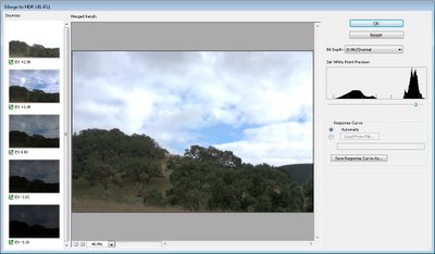
When the images are processed you will see your images combined to a single 32-bit image.

You’ll see a histogram in the top right corner which allows you to preview areas of the image. By dragging on the histogram you can see the lights and darks in the image. Drag the histogram to the far right and you’ll see all the shadow detail; drag it to the far left and you’ll see all the highlight detail.

Position the slider at an average position in the image and click Ok.


Step 3
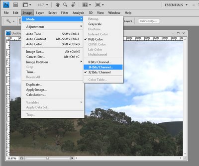
This opens the image as an HDR image at 32-bits per channel inside Photoshop. You can’t actually do anything much with this image as it is so you’ll need to convert it to an 8 or 16-bit image.

To do this, choose Image > Mode > 16 Bits/Channel.


Step 4
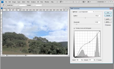
When you do this you will see an HDR Conversion dialog.

From the Method dropdown list, select Local Adaptation and make sure the Toning Curve And Histogram chart is shown.

Here you will fine tune the image. Drag the leftmost edge of the curve line in to the right so it touches the beginning of the darks in the image - this ensures you have some true blacks in the image.

Do this also for the highlights so that you get some true highlight areas.

You can then adjust the curve to your own preferences.

For this image, I wanted more lightness in the shadow areas and not so much in the lighter areas so I dragged the curve to give this result. This results in pleasing detail in the hill area as well as in the clouds.

Your artistic requirements for your own images will be different so adjust the curve until you get the detail in the image that you want to see.

When you’re done, click Ok.


Step 5
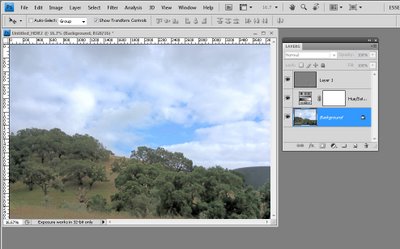
You now have a 16-bit image and you can go ahead and make the additional adjustments to it.

For example, I added a Hue/Saturation Adjustment Layer to boost the saturation in the image and then flattened the image to a single layer and applied a High-Pass Filter to it at a low radius to sharpen the image. The high-pass filter layer is set to Soft Light Blend Mode to finish the result.

If you want to save the image as a JPEG you'll need to render it as 8Bits/Channel now to save it.

Labels: , , ,

Monday, July 20, 2009

5 Lightroom mistakes to avoid


If you are new to working in Lightroom your first few weeks will be a steep learning curve. Here are my top 5 mistakes to be aware of and avoid when you're starting out. I hope they'll save you wasting time, getting frustrated and generally tearing your hair out.

1 Think - Navigate on the left – Keyword on the right.
Ok, so this isn't exactly true but basically, in the Library module, your navigation options are on the left and bottom of the screen and the Keywording options are on the right.

The typical mistake you'll make is to open the Keywording or Keyword List areas of the panel on the right and click on a checkbox for a keyword or click one of the keyword sets thinking that somehow this will select and display images with those keywords – Not so! Instead you just added those keywords to the selected image or images.
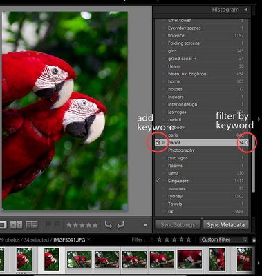

You can filter by keyword using the Keyword list in the panel on the right and you do so by clicking the small arrow to the right of the keyword – that switches to display all the images with this keyword.

2 Don't move your photos – except in Lightroom.
This is a biggie. Once you bring images into Lightroom, Lightroom tracks where they are on disk. If you delete or, worse still, move the images from one folder to another one, the links inside Lightroom will be broken. If you rename your folders then the links to them and to the images in them will be broken too. In a very short time you can wreak havoc on your Lightroom catalog – this is the voice of experience speaking here! In short, once your photos are in Lightroom, manage them in Lightroom.
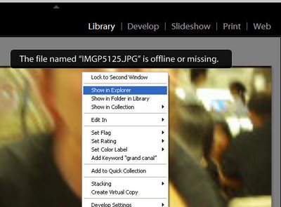

If you break the links to your photos, Lightroom will still display the previews and it will tell you the "The file named xxx is offline or missing". If you moved the image, right click it and choose Find in Explorer and you can then click Locate and browse to locate the folder you moved it to.
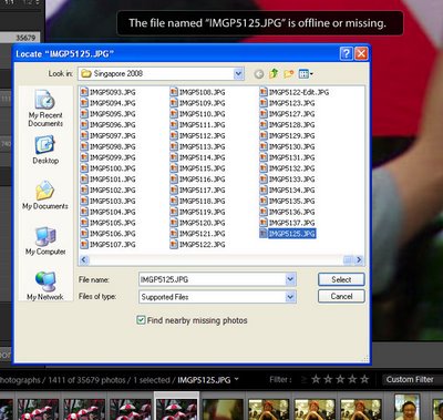

When you locate the missing image, click it to select it and also enable the "Find nearby missing photos" checkbox as chances are if this image has been moved other photos in the same area of the catalog will have moved too and Lightroom will now locate and update their details in the catalog too.

3 Don't by pass a valuable organizing opportunity
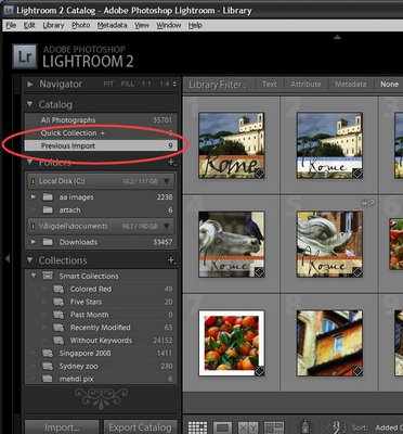

When you import images into Lightroom they’re immediately added to a new category called Previous Import. They stay there until you import more images. Having all your newly imported images in a single collection lets you do things with them such as adding keywords, sorting them, moving them into new folders and even preprocessing them as a group and without having to search for them.

However, you'll need to do some fancy footwork if you want to bring in more than one set of images into Lightroom and to manage them all at once using this temporary catalog. One such situation would be where you capture two or more cards of related images at a time such as a wedding or other event, or photo walk.

In this situation, you can avoid losing the benefits of the Previous Import catalog by dumping all the images from multiple cards into a single folder on your disk outside Lightroom and then import the folder of images into Lightroom. Now all the imported images will appear in the Previous Import catalog and you can organize and pre-process them as a group. They stay in this category even if you close Lightroom and reopen it and only disappear when you import another set of images.

4 Don't make work for yourself
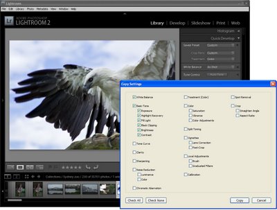

When you capture a number of images in a single location or with a particular light you can batch process them in Lightroom and save yourself hours of work. To do this, choose one representative image from the group and use either the Quick Develop tools in the Library module or switch to the Developer module and make your initial fixes there. Fixes that you might apply to a sequence of images include White Balance, Exposure, Recovery, Fill Light and Blacks. Remember you don't have to get it 100% right, just better than it was.

When you're done, right click this image and choose Develop Settings > Copy Settings and select the settings that you have just made to the image and that you want to copy and click the Copy button. Now select the other images in the sequence, right click and choose Develop Settings > Paste Settings to paste these changes onto all the selected images. These changes give you a starting point for your work in Lightroom.

5 Don't risk losing your sidecars
If you're working in Camera RAW (not DNG) any changes you make to an image in Lightroom are stored in the sidecar XMP file for the image - because it is not possible to write data into a proprietary Camera RAW file. So, when you send a RAW image to someone else they can't see your edits unless they have the sidecar XMP file that goes with it. Long term you need to make sure your RAW files and their XMP files always stay together.

Because of this, many users prefer either to capture in the non proprietary DNG format rather than Camera RAW if their cameras offer this as an option or to convert to DNG as the RAW image files are imported into Lightroom. Converting to DNG rather than working in Camera RAW ensures that changes can be stored in the DNG file making it easier to manage your images now and in the future.
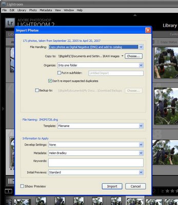

To convert to DNG as you import your files, choose File > Import Photos From Disk and select the folder or files to import. When the Import Photos dialog appears, choose the "Copy photos as Digital Negative (DNG) and add to catalog" command and then choose a folder to store them in. Complete the remainder of the dialog options and click Import to import and convert them in the one step.

Labels: , , , , , ,

Friday, July 10, 2009

Fixing Blemishes in Lightroom


Spot_before-after.jpg
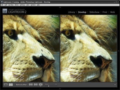
When you have an image which needs some spot fixing before printing you can often do the work in Lightroom and avoid the necessity of a round trip to Photoshop. Lightroom has both a Clone and a Heal tool available for fixing blemishes and removing problems such as spots caused by dust on your camera's sensor.

To see how to use these tools in Lightroom, start by selecting an image to fix and select the Lightroom Develop module.

Step 1


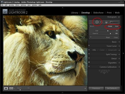
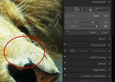
Locate the Spot Removal tool which is situated below the Histogram and to the immediate right of the Crop tool. You can also select it by pressing its shortcut key N.

For the brush options, you have the choice of Clone or Heal so select the option to use.

Clone works similarly to the Clone Stamp in Photoshop where you select the portion of the image to fix and then the portion to replace it with. Apart from choosing the Size of the brush and the Opacity Lightroom simply replaces one area of the image with another without making an attempt to blend the fix.

If you choose Heal then Lightroom samples the area you're trying to fix and attempts to blend in the replacement area so the fix is less apparent.

Step 2

Select Clone or Heal and then adjust the size using the slider or the square brackets [ and ]. Your brush size needs to be large enough to cover the area to fix.

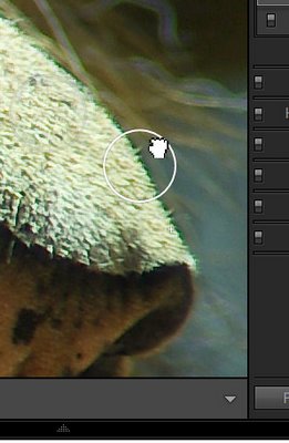
You can click on the area to fix and leave Lightroom to choose the source image data to fix it with or click on the part of the image to fix and continue to hold the left mouse button as you drag to find an area to use to for the fix. You will see a preview of how the fix will look to help you determine a good part of the image to use. Only let go the mouse button when you have your selection in place.

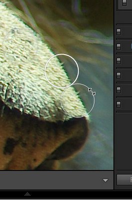
When you have applied the fix you will see two circles on your image – they appear when you hold the Spot Removal Tool over the image. The circle with the thickest edge is the selected area and the circle with the + symbol in it defines the area you are fixing.


If you did not get the fix exactly right you can click inside either of the circles and drag the selected circle to a different position.


You can also select a circle and then position your mouse over the edge till it turns into a double headed arrow and then drag to resize it.

You can change a fix applied using the Heal option to a Clone fix (or vice versa). To do this, select either of the two circular marker and click Heal or Clone in the Develop tools panel to change the fix type. This allows you to experiment to find which gives the better results.

In our example, Heal worked well on the lion's nose in areas which were all hair and Clone worked along the top edge of the nose where the fix markers spanned part of the nose and part of the background behind.

To see the image without the circular markers, press H to hide them. Press H again to display them.

To see the Before/After results reflecting just the effect of applying the Spot Removal Tool, click the On/Off switch in the Spot Removal tool area of the Develop panel. This works better than the backslash key (\) which toggles on/off all the fixes you have made to the image and not just the most recent one.


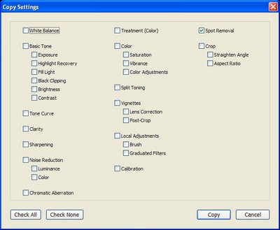
If you have problems such as sensor dust that appear in the same position in a series of images, you'll appreciate the ability to copy the Spot Removal tool fix from one image to others. Right-click the fixed image, choose Settings > Copy Settings and from the Copy Settings dialog enable the Spot Removal checkbox disabling all other options that you do not want to copy. Click Copy to copy the effect and then paste it onto the other images which also suffer the same problem. While this may not be an ideal fix for all of them, it will give you head start on fixing most of them.

Labels: , , , ,

Saturday, July 04, 2009

Photoshop Creative: Make a Collage Photo Banner


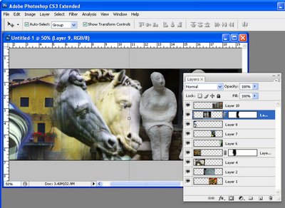
When you’re creating a photo blog or website a photo banner lets you showcase a range of your work. You can create a collage of photos for a banner in Photoshop or Photoshop Elements very easily. Here's how


Step 1
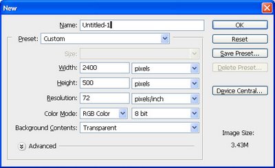
Start with a new image the size of your banner or a multiple of it. So, for example, if your banner is going to be 1200 pixels wide by 250 pixels you can start with this size image or double it so you have a bigger space to work and size it down as the last step.

Here I've created a document 2400 x 500 at a Resolution of 72 pixels/inch, RGB Color and with a Transparent background..


Step 2
Open the photos to work with. These should be fixed and color corrected but they don't need to be sized. I like to open more images than I will use so I have lots to choose from. A combination of close-ups and distance shots gives your banner a lot of variety. Flatten all the images to a single layer.

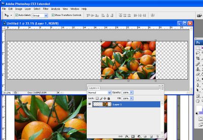
Select the Rectangular Marquee tool and drag over an area to use from the first photo. Select a generous portion of the image allowing plenty of room to the left and right of the main portion of the image that you are interested in as you will use this area to blend the layers. Chose Edit > Copy and then switch to the banner image and choose Edit > Paste. Close the original image.

Press Ctrl + T and then Ctrl + 0 and size the image to fit your banner. Use the Move tool to position it in place.


Step 3
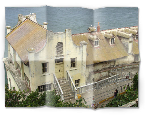
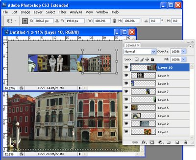
Select the next photo to use. Copy a piece from it and paste it into your banner image. Size it and move it into position. Continue to do this until your banner is full. The images should each appear on a separate layer and they should all overlap by significant amounts.

If desired, drag the layers into a different order to position the images where they should appear in the collage.


Step 4
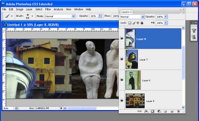
Starting on one side of the image, select the Eraser and select a soft brush or a textured one such as the Chalk 44 pixels brush. Adjust the brush size so that it’s big enough to work with, reduce its Opacity to around 50 percent and click on the layer in the layer palette that contains the image to blend.

Erase over the edge of the image to reveal the layers below. As you work, give some consideration to how you want the images to blend together. In some instances, simply softening the hard edge of the image will be sufficient. However, if there are significantly different colors on each layer you may want to be more creative about how you blend the layers together.


Step 5
If you’re familiar with using masks you’ll find that you'll get better results with a mask than you do with the eraser as the blending can be easily undone.

To use a mask, add a mask to the layer that you’re working on and then paint over the mask in black to remove the image from this layer. If you make a mistake, paint in white. To add a layer mask, click the Add a Layer Mask icon at the foot of the Layer palette.

Work across the image softening the edges where the images overlap. It’s at this point that you will see the benefits of having plenty of overlap between the images as this will give you plenty of room to blend the images together.

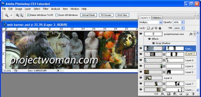
Some layers may lend themselves to being used as overlays rather than a part of the image. For example, a photograph of text can be placed over another image with its Blend Mode set to Multiply and its Opacity lowered so you get a layering of photos.


Step 6
Finish your banner by adding some text. Click the Text tool and click on the banner and type your text. Use a Drop Shadow layer style to make the text rise above the background so it will be more easily read.

Ready to learn more? Here are some more creative Photoshop tutorials from my blog:

Photoshop: Fold a photo


Photoshop: Turn daylight into sunset in one easy step.

Labels: , , ,

Wednesday, July 01, 2009

Creating a Triptych in Lightroom


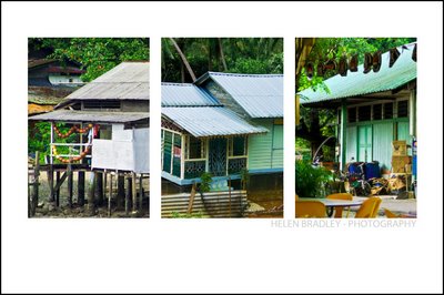
When presenting your photos you will sometimes want to create and print them as a series of three images on a single sheet of paper rather than a single image. You might want to do this, for example, to use to decorate a gift card or for framing.

Using Lightroom you can assemble multiple images ready to print and a triptych or series of three images is one way to do this. Here's how to use the Lightroom Print module to assemble a triptych for printing and how to save it as a reusable preset:


Step 1
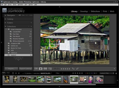
You can create a triptych for any images that you have in Lightroom so begin by selecting the folder or collection which contains the images in the Library Module.


Step 2
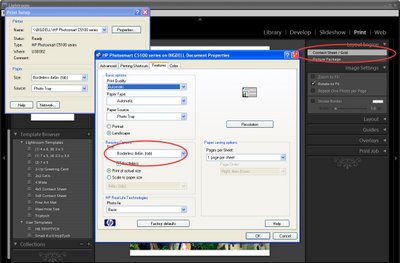
Switch to the Print module and from the Layout Engine options in the top right corner of the screen, select Contact Sheet/Grid.

In the bottom left of the window click Page Setup, select your printer and select the paper size to print on. Lightroom uses the paper size you select as the paper size for your contact sheet. Select Portrait or Landscape orientation as desired (I chose 4 x 6 in Landscape), and click Ok.


Step 3
Use the layout options on the right of the screen to configure the output image to show three images.

Set the Layout to 1 Row and 3 Columns. Set the Width and Height of the cells using the sliders and the Top and Bottom margins to your desired values. I like to add more space below the images and less above them.
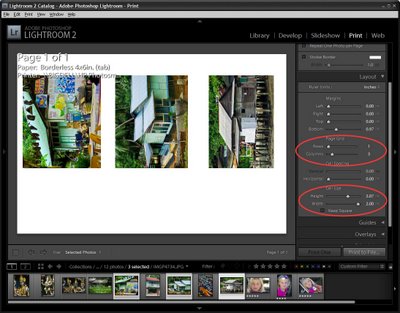
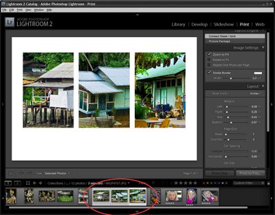
To fill the three slots with images, select three images in the filmstrip by Shift + clicking on them.

To display or hide the guide lines, enable or disable the Show Guides checkbox in the Guides area of the panel.


Step 4
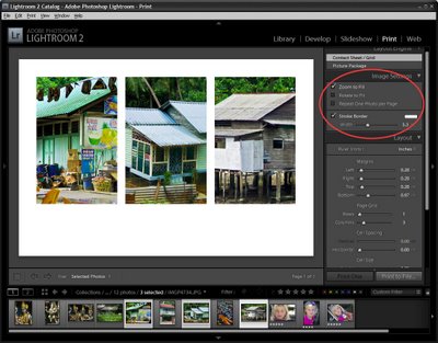
In the Image Settings area at the top right of the screen, enable the Zoom to Fill checkbox and disable both the Rotate to Fit and Repeat One Photo per Page checkboxes. Use your mouse to drag each image around in the cell to find the best position for it.

To add a space between the images either adjust the Cell Spacing: Horizontal value or if you don’t plan to use a contrasting border, enable the Stroke Border checkbox and add a white border around the images.


Step 5
The images appear from left to right in the order they appear in the film strip. To change the order in the triptych, drag them into the desired order in the film strip.


Step 6
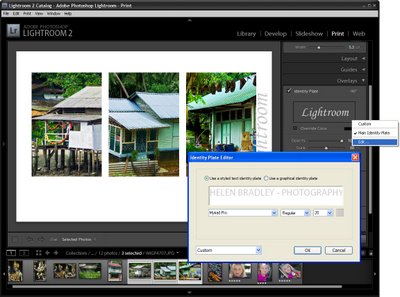
To add an overlay, open the Overlay group and enable the Identity Plate checkbox. Where the identity plate shows Lightroom, click the down-pointing arrow and click Edit.

Type your name or other information into the identity plate area, format the text and click the Custom dropdown list and choose Save As to save it so you can use it again in future. Click Ok.

Adjust the Opacity slider to make the Identity plate more transparent and use the Scale slider to scale it to size.

Opposite the Identity Plate checkbox is an indicator that probably reads -90 degrees. It is a dropdown list so click it and choose an alternate rotation for the identity plate, if desired. You can also drag the identity plate into position using the mouse.


Step 7
To print the finished image, click the Print button at the foot of the panel.

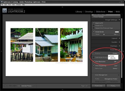
You can also save the image as a JPEG file by selecting Print to JPEG file. Select the file resolution and the JPEG quality and click the Print to File button to create an image that you can print later on or send to a commercial printer.


Step 8
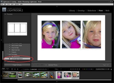
To save your new design, from the left of the screen click the + symbol adjacent to the words Template Browser and type a name for the template and click Create. You can then use it at any time by selecting it and selecting the three images to add to it.


Ready to learn more about Lightroom? Here are links to two of my other Lightroom tutorials:


Sharpening in Lightroom 2


Lightroom: Spot fixing with the Adjustment Brush

Labels: , , ,